
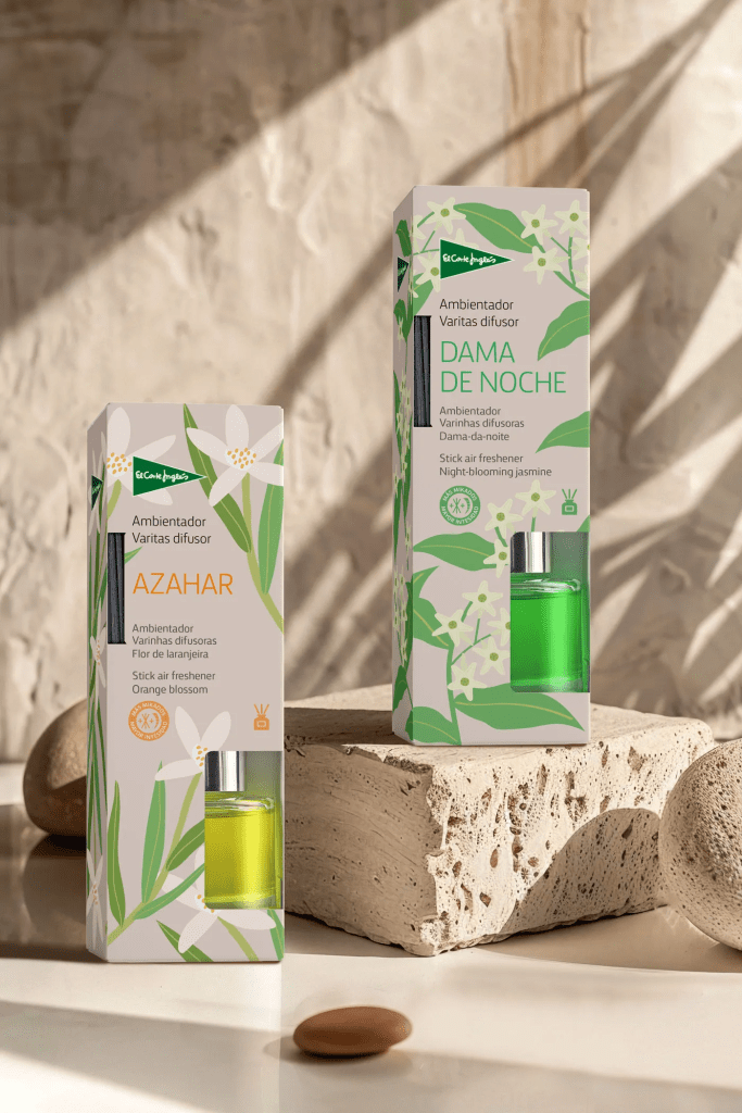
For the design of the air freshener line for El Corte Inglés, we aimed to create packaging that would capture the natural and elegant essence of each fragrance, delivering a fresh, delicate, and cohesive image aligned with a product designed for home well-being. We started from a visual approach that blends botanical illustration with a clean, contemporary aesthetic.
A neutral background acts as a canvas on which organic illustrations of each key flower—such as orange blossom and night-blooming jasmine—bloom with a flat, stylized graphic style that brings freshness without losing sophistication. Color accents in the fragrance names create clear differentiation and sensorially evoke each scent.
The sans-serif typography contributes to a clean and modern reading experience, adding warmth and approachability. The El Corte Inglés logo is seamlessly integrated into the design, maintaining its presence without visually overpowering the composition.
The result is a packaging line that breathes naturalness, elegance, and modernity—designed to be visually appealing on the shelf while conveying a sensory experience of calm and freshness within the home environment.

Leave a comment